I like this analysis, but the author doesn't mention that an assumption of the "complainant" is that carbon is pollution - it's anything but that!
Sent by a reader:
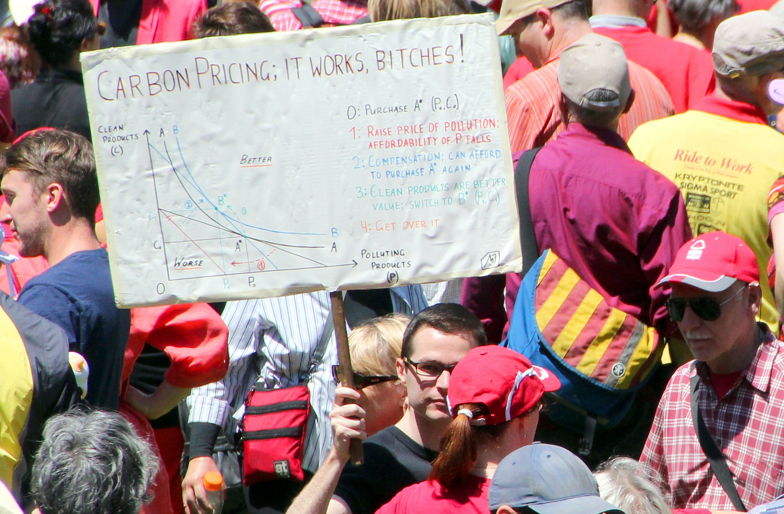
(Click to enlarge.)
Some questions for the economics students:
- Which vertical line segment illustrates the carbon tax revenue?
- Which vertical line segment illustrates the compensation paid by the government?
- Where does the difference come from?
- What difference would it make if you changed the axis labels from "Polluting Products" and "Non-Polluting Products" to "Watermelon" and "All Things That Are Not Watermelon"?
Answers below.
Answer key: On the vertical line segment descending from B*, the distance from the black line to the red line represents tax revenue (measured in units of "clean products"). The longer vertical line segment descending from B* all the way to the red line represents compensation paid by the government. The difference comes from — hrm. We don't seem to have that information.
So what this sign proves is that if you pay $100 in carbon taxes and get back a $150 gift from the government, you might be better off. As a bonus, it also proves that if you pay $100 in watermelon taxes and get back a $150 gift from the government, you might be better off.
The moral of the placard, then, is not that carbon taxes can be good. It's that all taxes can be good, provided we all get back more than we pay in. All it takes to make that happen is a magic genie (not pictured).
No comments:
Post a Comment